A calm mark for an honest analyst.
It had to look like what it claims to be: careful, evidence-led. Desaturated neutrals, one signal colour — the discipline of an intelligence document, not an ad-spy dashboard.
[01]Product · Brand · Founder-led· 2026
An MVP: AI reads your brand and your rivals’ public pages, tracks what changes, and turns it into a monthly report ending in three ad ideas. Identity, product and the Next.js build — solo.
[01]Overview
An MVP of a simple idea: point AI at your competitors' public pages, and get back what changed, what your brand is missing, and three ads worth testing.
It's an MVP, and framed as one: private beta, pre-revenue, one paying plan defined but not yet a business. What follows is the design and the working build, not a success story.
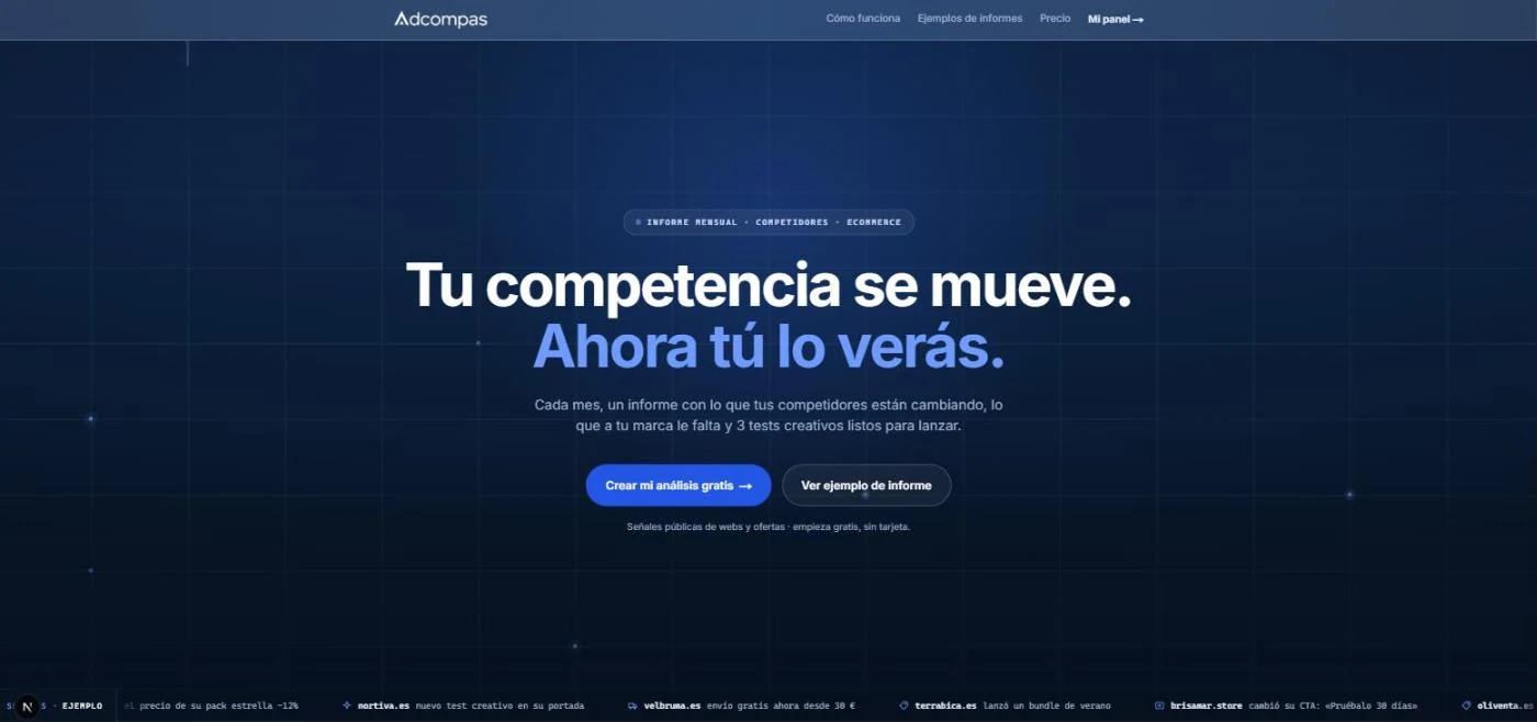

It had to look like what it claims to be: careful, evidence-led. Desaturated neutrals, one signal colour — the discipline of an intelligence document, not an ad-spy dashboard.


A pulse-line mark inside a rounded square, paired with a plain-spoken wordmark. No gradients, no mascots — it needed to survive being small in an email as much as large on a report cover.
#F6F8FCDefault background of every marketing surface — whitespace as a brand asset.#0B1F3AHeadlines, dark signature panels, report covers.#4E7BFFCTAs, links, live signals — blue means something you can do.#B7791FDetected changes, low-confidence markers — used sparingly.Two webfonts, on purpose. Anton reads like a newspaper masthead for section markers and big numerals; Inter carries everything else, including headings. No italics anywhere — emphasis comes from scale and colour instead.
A documented do/don’t table for tone, so the voice doesn’t drift between the landing page and the report someone pays for.
Paste a URL. The brand is already detected, competitors already suggested, analysis already running — before you’d normally finish a form. No card until there’s something worth paying for.
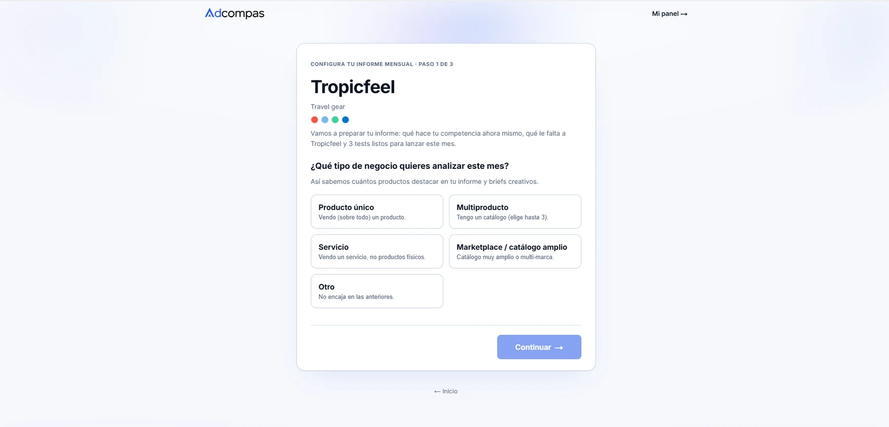
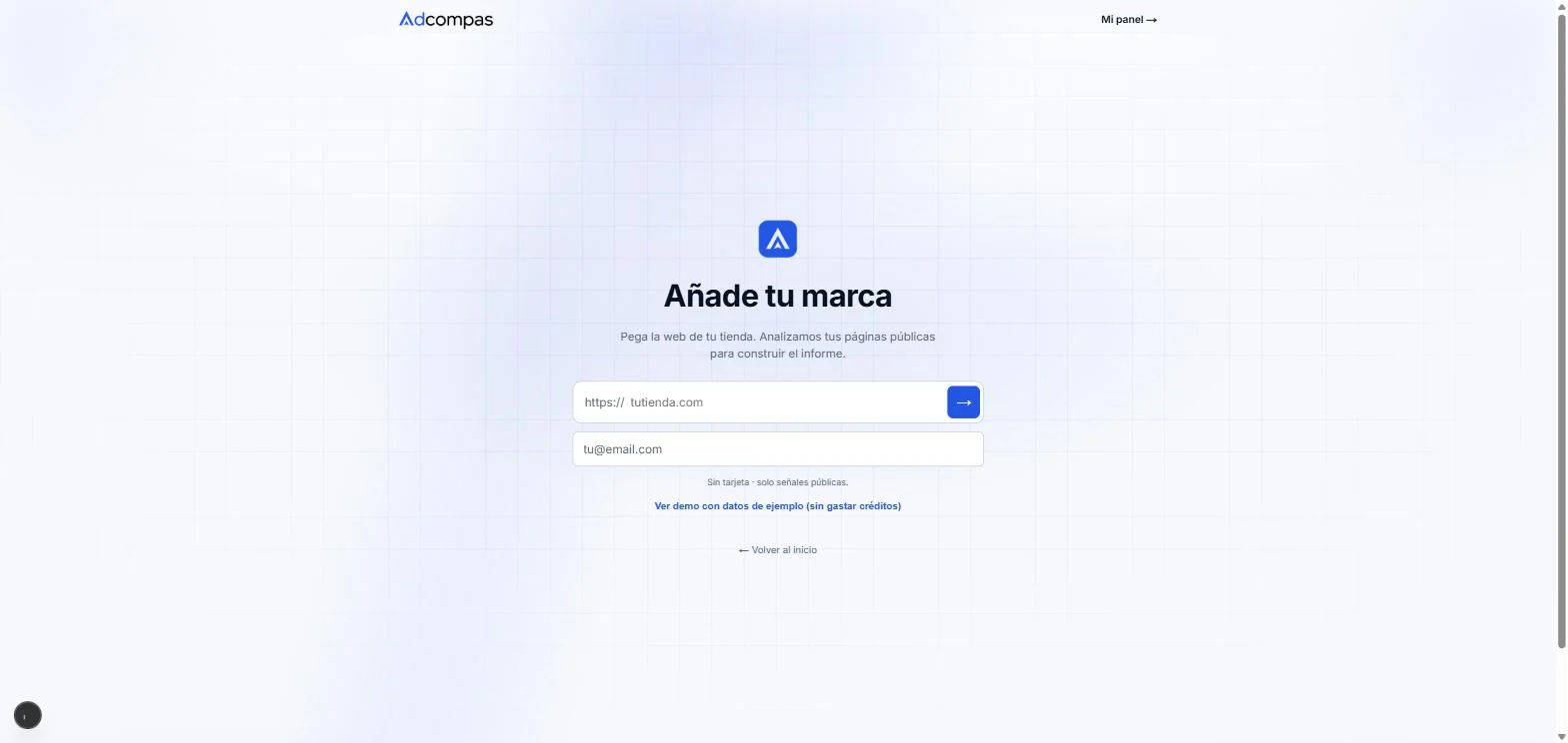
One field. No card, no account — just the store URL and an email.
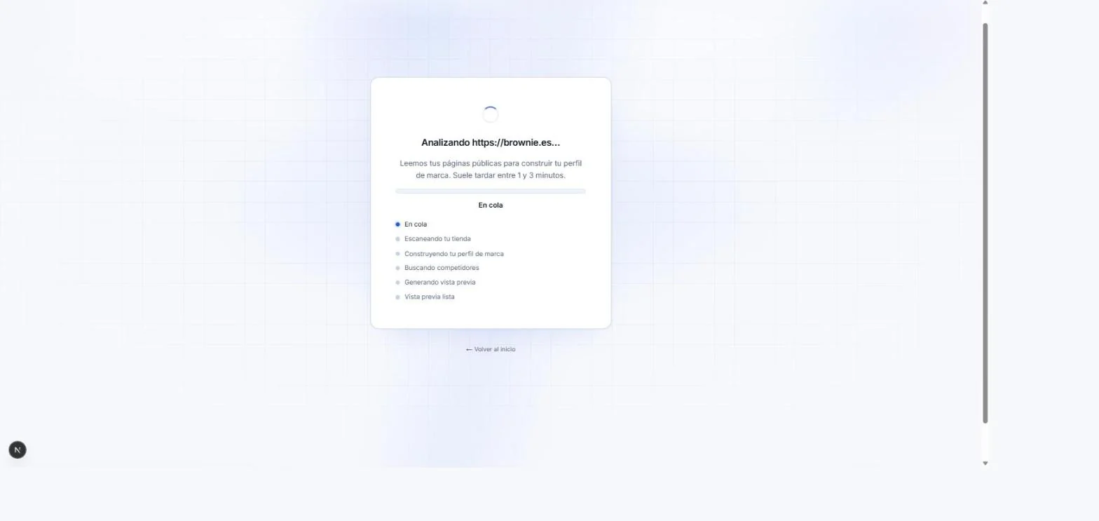
A real background job, with semantic status — never a spinner lying about what's happening.
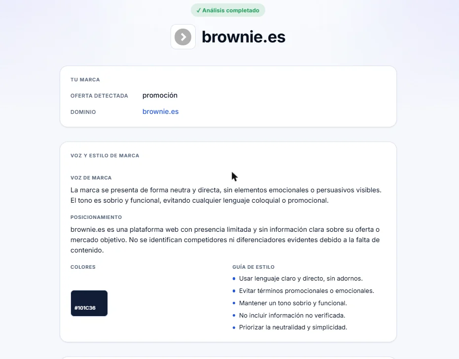
The no-hallucination rule, visible in the UI: thin signal reads as "presencia limitada," not a padded guess.
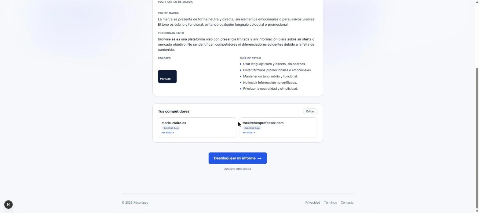
The paywall shows up after the product has already proven it read the site — not before.
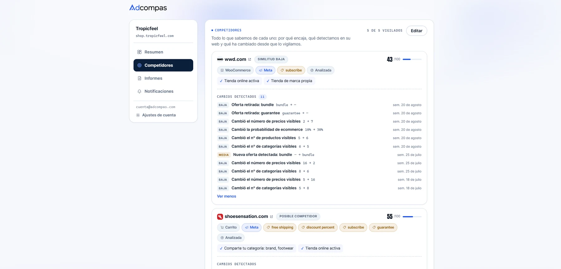
Every competitor scored out of 100, tagged with what was actually detected, and logged week by week. The hardest thing to design honestly.
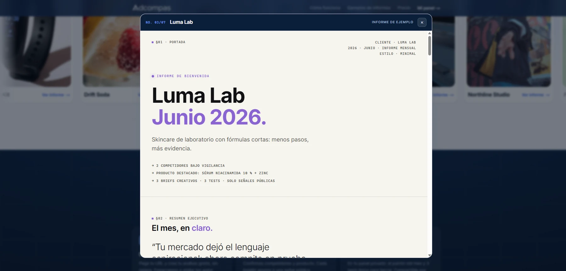
Every claim carries a confidence score and an evidence ID; unsupported ones render as “no detectado”, never a guess. On top of that, each report reads the client’s own brand and swaps visual register — same sixteen sections underneath.
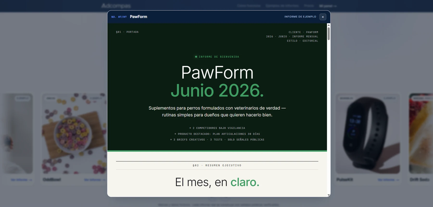
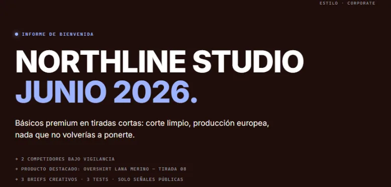
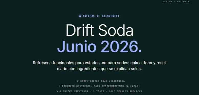
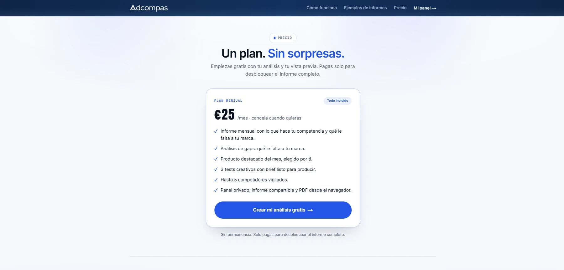
No fake strikethroughs, no countdown timers. The price sits flat, in tabular numerals, next to deliverables rather than adjectives.
Solo, end to end. The design only meant something once it was load-bearing in a running product — so I built it, rather than comping it.
Brand identity, from mark to a documented voice-and-tone kit used across every surface — including the report a client actually pays for.
Product & landing UI, including the theming system that adapts the report's typography and palette to each client's own detected brand.
All product copy in Spanish, written to a "cercano e inteligente" register with an explicit do/don't table — nothing left to drift page to page.
The technical build: Next.js and Supabase, a Playwright scraping worker, Stripe Checkout, and an OpenAI Structured-Outputs pipeline under a hard no-hallucination rule.
A zero-spend rule shaped the brand as much as any mood board: free tiers only, pay for a tool once a client covers it. Restraint wasn’t the compromise — it was the point.
[02]Next project
Move from Adcompas's product and brand system into Hardcore Crew's full identity and drop system.